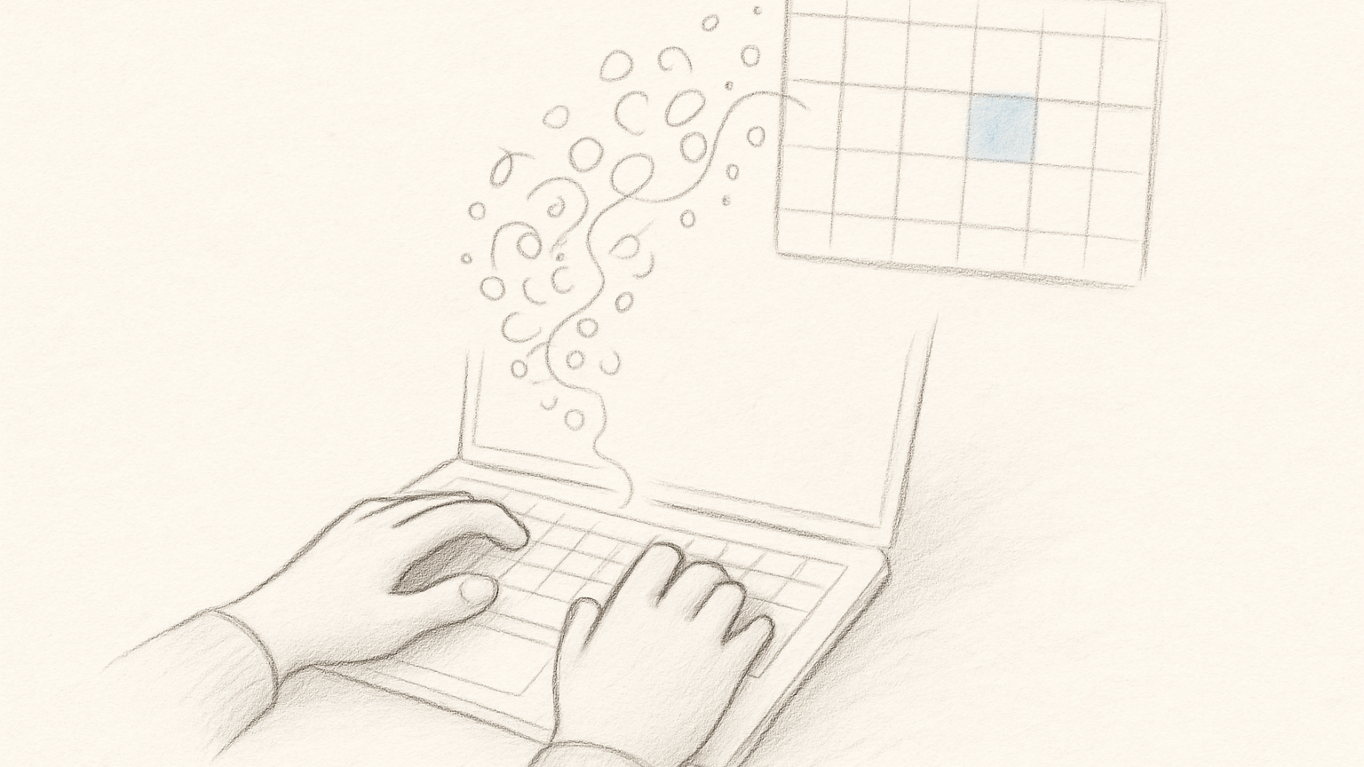
The cost of a click-only interface is not measured in milliseconds. It is measured in interruption.
Planning often happens in the typing pose. Your hands are on the keyboard. You are naming the work, adjusting it, remembering a second thing because the first one made room. Reaching for the mouse is small, but it breaks the line.
That does not matter for every user or every moment. It matters for people who think by writing. For them, a planning app should keep up with the sentence before the system gets involved.
I built Slate to be usable with a mouse, but I do not want the mouse to be the price of every thought.
Keyboard support should be boring
Keyboard-first does not mean every action needs a secret chord. That way lies the help overlay as personality test.
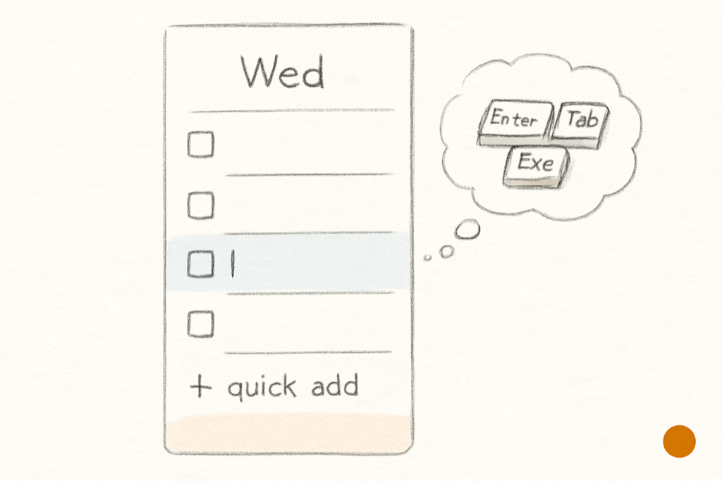
The useful bindings are ordinary: add a task, complete a task, move a task, tag a task, search, undo. These are the actions that happen while thought is still moving. Everything else can be slower.
A keyboard-first app should feel like the interface is getting out of the way, not showing off its command map.
Slate keeps the keyboard close to the surface. Quick add sits at the bottom of each column. Inline editing happens in the row. Number keys apply the five highlight colors. Backtick clears them. Search is available without making the user excavate a menu.
None of this is meant to be impressive. Good.
Tags are better when there are fewer of them
A tagging system can become a second to-do list if it is allowed to multiply. The more tags you have, the more each new task asks a small classification question before it can exist.
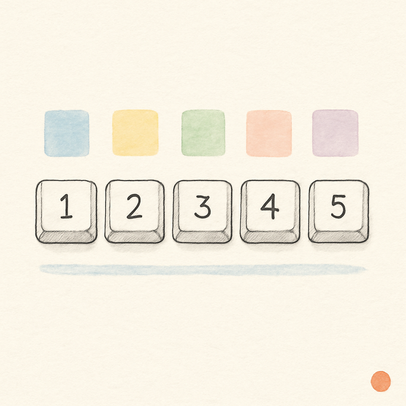
Slate uses five highlight colors as the whole tagging system. They are user-nameable, which gives them enough meaning, and limited, which prevents them from becoming a research project.
The number keys 1 – 5 apply them quickly. Backtick clears them. Five colors can mean clients, energy levels, modes of work, or anything else the user cares about. They cannot become a forty-tag ontology with bylaws.
That constraint is not a missing feature. It is protection.
Moving work is part of writing the plan
A weekly planner needs movement as much as entry. Tasks move between days, within a day, and between the Idea Backlog and the weekly slate. If moving work requires too much friction, the plan hardens before it should.
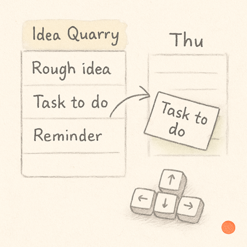
Slate supports drag-and-drop because some movement is spatial. But the point is not the drag itself. The point is that the plan remains movable. The underlying ordering can change without rewriting the neighboring tasks.
Keyboard-first input and fluid movement serve the same idea: planning is not filing. It is arranging.
The interface should keep its hands quiet
There are two bad extremes. One is the app where every action requires the mouse, a menu, and a small sigh. The other is the app that turns the keyboard into a cockpit.
The better middle is an interface where common actions have obvious shortcuts and the rest can wait. Add the task where you are. Edit it where it sits. Tag it with one key. Move it when it belongs somewhere else. Search when memory fails.
The week is already enough to think about. The tool should not become a second thing to operate.